
Rubbout 2025 Poster #1 - Digitize
So here’s the wallpaper pack for the Rubbout 2025 - “Digitize” Poster. And this piece had a heck of a genesis. The brief from meeting with RbbrDiscoPunk of the Rubbout team was pretty loose. The event, running from April 4 to 6, 2025 here in Vancouver is rolling with a “Tron-esque” theme. As with 2024, there is a series of four promotional pieces, building up to the event weekend. So, expect more, but expect no spoilers.
Skip to the end if you just want the download, without the backstory.
For the first poster, the concept of “Digitize” and having person entering the grid was thrown around. “It would be cool if he was digitized by light-cycles.” One of the hardships of getting into the mindset for the piece was re-watching Tron: Legacy, which stands up remarkably well even if it reduces the eponymous characters backstory to one line, “I fight for the user.” I relies on an animated series, Tron: Uprising, to fill in the gap. Honestly, that series holds up way better than it has a right too also.
That said I didn’t want to lean on the animated series style, it’s cool, but not in line with Legacy, and even less in line with any preview art from Tron: Aries. I also didn’t want the Rubbout piece to draw too much from the inspiration.
So I got down to sketching concepts for a figure being “Digitized” and here’s some glimpses at that process.
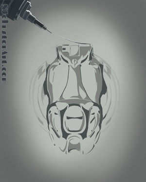
The first rough actually had more of a Total Recall feel to it. It didn’t really land the idea of digitization in my mind.

I did like the light-cycle wheel and trail to it though. So the next draft included those, but amped up the “Digitizing” theme.
The problem with this one was one of internal logic. I’d didn’t make sense to me that the right side of the figure, closest to the digitizing device, was the most digitized. It’s a world building thing. I also didn’t feel the allusion to the light-cycle was strong enough. So next rough…
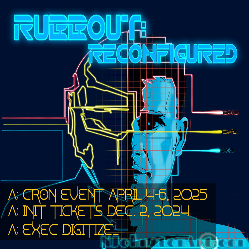
At this point most of the elements for the final piece are in place, having switched to an overhead view of the light-cycles and their trails. The trails themselves are tracing the figure and leaving digitization behind, including starting to build the character’s Daft Punk inspired helmet. Still, without a background the image was lacking depth. I also felt the character would benefit from less lighting, making the figure starker.
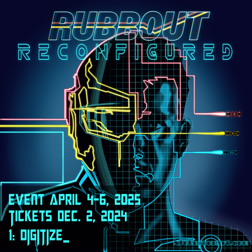
To this end I dropped out the figure’s skin tone, then added more of the helmet. Still it needed some background…
Procreate, the drawing software I primarily use, has a symmetry function, allowing the drawing quick and dirty creation of symmetrical designs. Great for tattoos I hear, but combined with the light brushes it helped make short work of this background.
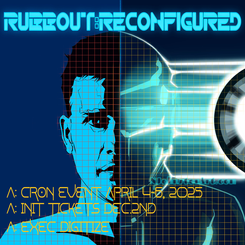
To be honest I think this is my favourite ittereation, excepting that the armoured shoulder on the left is way too high. Also note by this time, I’d received the actual Rubbout logo for this year. Folks wanted the “Reconfigured” subtitled tightened to fit more tightly underneath the “Rubbout” lettering. Fair, you don’t want a subtitle more prominent than the event title.
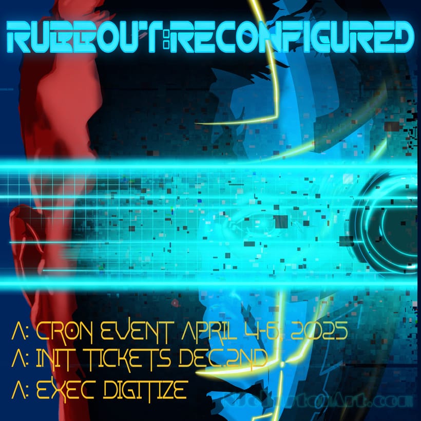
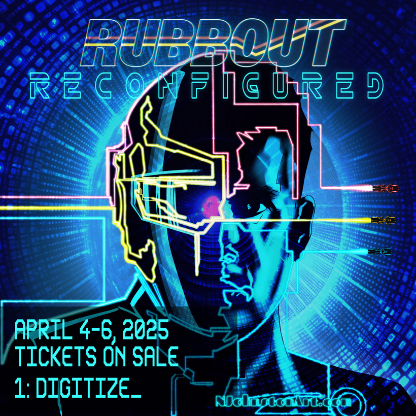
Finally we arrive at the released promo piece…
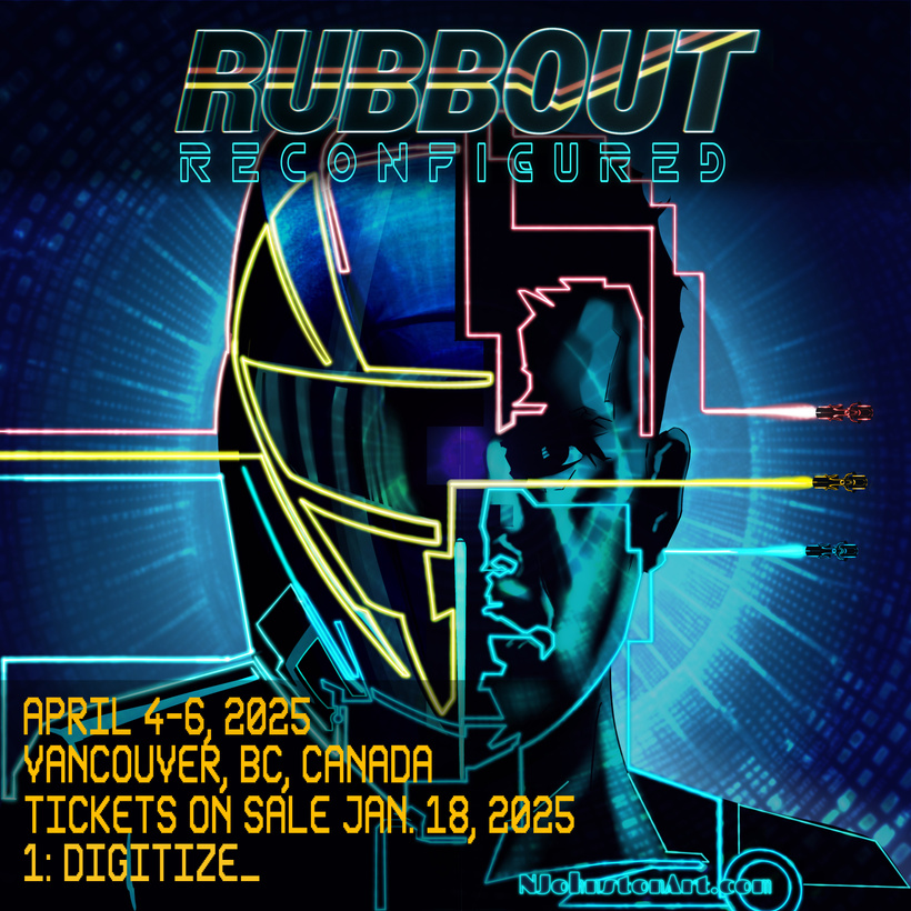
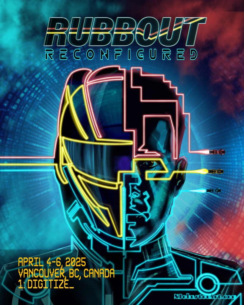
Then one more hurdle, I wanted to release collector and standard edition posters for this, which have a different aspect ratio, and resolution to the online promo piece. This lead to a final redraw, and also became the version used for the wallpaper pack bellow.
Get the Wallpaper Pack Download with paid access:

